
My Brand Glow Up: Why SEO (and Design) Are Always Evolving
Why SEO Glow Ups Never Stop
Sometimes the best way to explain SEO is to live it. My brand, SEO But Cute, just got its own glow up and it reminded me of one of the biggest truths in marketing: nothing is ever “finished.”
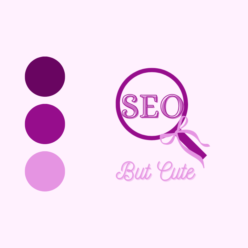
Before: Early Brand Colours and Energy
When I first started, I leaned hard into pinks and purples. They were bright, playful, and definitely eye-catching, but they didn’t fully reflect me. It felt like I was experimenting, trying on colours just because I liked them, not because they represented my brand long term. It was fun, but a little more “early days energy” than the balance I was actually looking for. Cute at the time, but not quite the full picture.
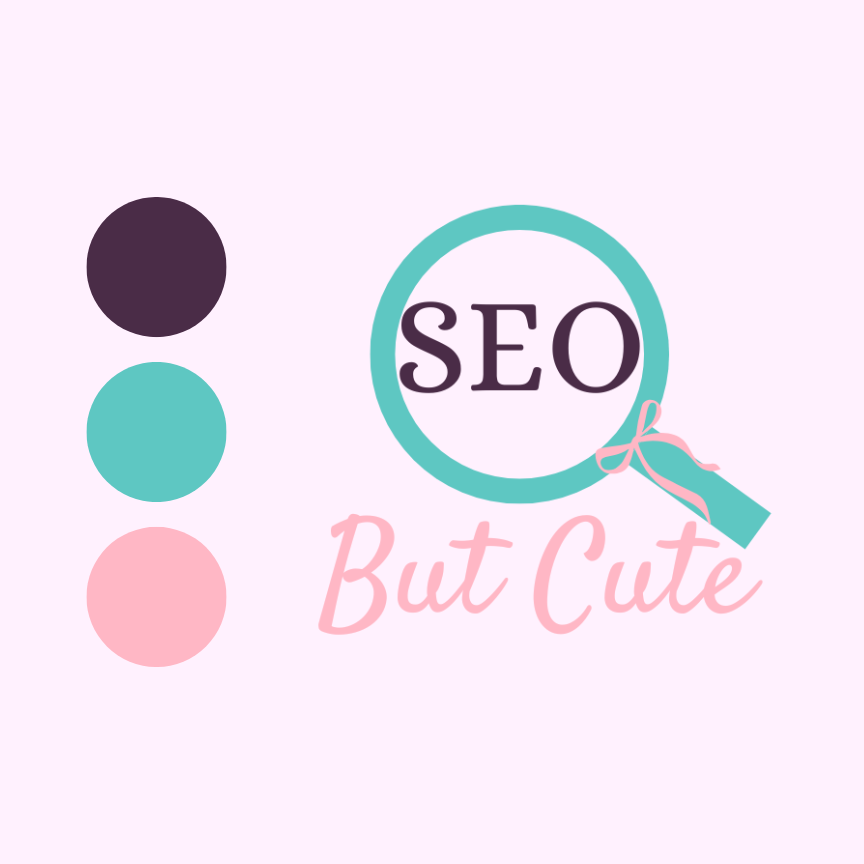
After: A Balanced SEO Brand Palette
Now I’ve landed on a palette that feels right. Plum brings depth and a sense of grounded confidence. Teal adds clarity and structure. Peach pink softens everything and keeps it warm and approachable. Together, they feel grown, but still playful. I haven’t outgrown pink. I’ve figured out how to use it in a way that feels like me at this stage of my journey. And the updated logo pulls it all together in a way that finally feels polished.
SEO & Design: Growing Together
My brand glow up is more than a design change. It’s a reminder that evolution is baked into both SEO and life online.
✨ Curious? Peek at the before and after on my Instagram and let me know what you think!
